How should you put your colours together? Can you wear black and white? Can you wear only an accent of colour or should you always wear two colours. Should prints blend or contrast? This blog answers these questions for each season tone from the high value contrast winter seasons to the high colour contrast spring seasons.
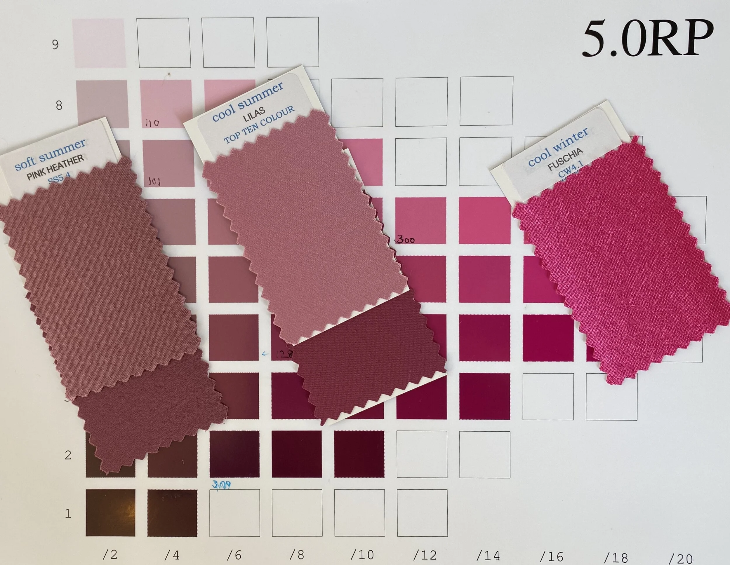
Contrast is a very important part of colour analysis. The last post discussed COLOUR CONTRAST, this one discusses VALUE CONTRAST. VALUE CONTRAST is the difference between your darkest and lightest values. I show you how I analyse my VALUE CONTRAST and how to analyse your own. There are examples of low, medium and high value contrast women.
A detailed guide of typical Light Summer features and client examples to show that many Light Summer clients are unique. The first of a series of blogs to investigate the Light Summer Palette in order to tailor it to every extraordinary Light Summer
Colour Analysis is usually a progression of someone’s colour journey - this one was a revolution. Read about Jeanette who loves bright colours but found that soft colours loved her!
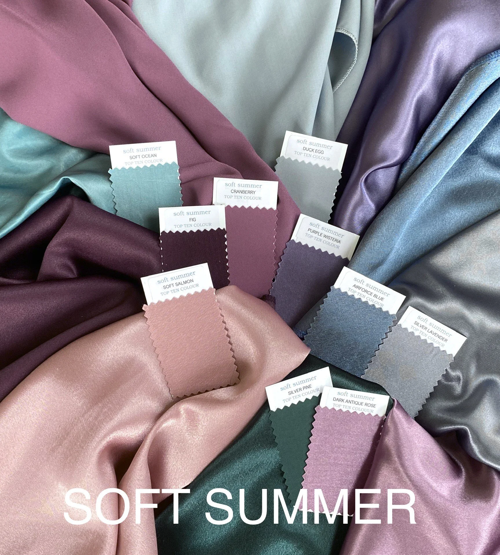
This post analyses the Hues of Soft Summer - the beautiful pinks, purples, blues and greens all with the overlay of silvered water that make this palette the most beautifully blended palette of them all.
The most important characteristic of colours worn by a Soft Summer person is the softness of the colours. The chroma level is very low with a lot of grey added to every colour in the palette
Only five percent of my clients are men - yet they invest a lot of money in their formal clothes and wear these items many times. Even more than women it is important that choices for suits are the best they can be - black is not always the most flattering colour and can make you look tired, washed out and older - not the impression most men would want at work. Here Jim discovers charcoal and navy with shirts and ties in light blue, ice pink and white make him look more energised and youthful than his previous black suits and white shirts.
This post starts a series of Soft Summer blogs that take the palette and look at how it is created and how it can be used according to the unique features of each person. In this opening post, I look at four different clients of which one is typical and the other three have unique features.