


Value Contrast and Colour Contrast for all Season Tones Explained
Anni Wickham
In previous posts I analysed my own value contrast and colour contrast and invited you to analyse your own. It’s a really nice introduction into putting your colours together in a way that matches your season - and therefore harmonises with your natural features.
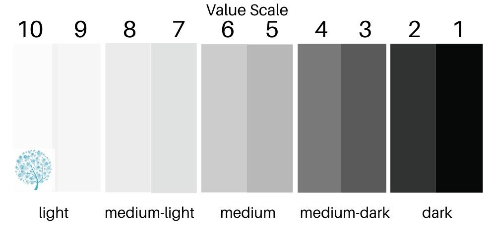
I thought it would be interesting to list out all of the seasons and where a typical person within that season would be on the two scales. Here is a reminder of what the Value Scale looks like - from white at a value of ten to black at a value of one. We simply compare our features in a monochromatic photo to the grid to work out the extremes, and look at how blended our features are to work out if we need to avoid wearing our extreme values together (using our mid values), or whether we should have the biggest contrast between our light features and darkest mirrored in our clothing. I’m also looking here at how the colours we select should be separated - should we have sharp distinct barriers between the colours or soft blending?
Colour contrast has very little written about it and is the inspiration for me researching for this blog. I am giving a guide on how many colours and neutrals can be combined for each season and how contrasting these colours can be. The lowest level of contrast would be no colours and just neutrals from the palette mixed all from one neutral in a monochrome - so a dark grey and light grey for example. The next example would be to add a colour to the neutrals as an accent. To get to a medium level of contrast we could use two colours together and create more contrast between them - for example using hues that sit near each other on the colour wheel(analogous) such as green and blue. To create high colour contrast we could use two colours from opposite sides of the colour palette (complimentary pairs) or several colours from around the colour wheel. Below is a colour wheel with the numbers of colours you can wear at one time according to your level of colour contrast.
As I have worked through lots of reading matter on colour contrast I have found that consistently the warmer the season the more colours can be worn. This is a bit of a light bulb moment for me. Both cool seasons have the least amount of colour activity, cool seasons with spring or autumn influence have a little more, warm seasons with only a little winter or summer influence have a little more and the warm seasons both have the most colourful outfits and complimentary pairings. The warmth of the sun on Warm Spring and Warm Autumn provides a vitality to all of the colours within the palette and allows the wearer to wear several of the colours together without being over powered. Both of these seasons cannot wear grey, black or white - so strictly speaking they have no neutrals available. Putting an autumn or a spring in a one colour monochromatic outfit is dull - Warm Spring is vibrant and needs contrast which can only come from colour combinations as there are no extremes of value in the palette. Equally Warm Autumn needs richness from mixing it’s gold spicy based colours together. These are the seasons where we want no restraint but a blaze of colour - and I only just realised why!!

WINTERS
BRIGHT WINTER
The first woman in the photos below has typical jewel eyes and bright skin of a Bright Winter. Loving the blue hair too.
VERY HIGH VALUE CONTRAST - very light skin and very dark hair (even the natural eyebrows are very dark). She could wear black and white together and dazzle. She actually should always wear an element of her clothing in high contrast - if she is wearing black, then she ideally needs white or an icy light as a contrast. It could be as small as shoe laces, buttons, a narrow belt, jewellery, a bag, topstitching - but somewhere in her outfit we need to see a reflection of her personal high value contrast level. By mirroring the high contrast in her features in her clothing she intensifies the contrast in her features. The contrast between the light and dark neutrals must be very sharp to mirror the distinct features within the face. Colour blocking and dramatic geometric prints are perfect.
MEDIUM COLOUR CONTRAST - oh those eyes! This is the brightest of all the cool season palettes - it can be overwhelming when a client sees all those bright swatches on a rail - when I explain that they can have a wardrobe full of neutrals and use one or two of these colours as their highlights the relief on their faces always makes me smile. Black and white may provide the correct balance of value contrast - but they do not do justice to the brighter colouring and some colour should always be present. Winter seasons are all sophisticated and a little reserved in their use of colour. This woman will dazzle - but not with a full rainbow of colours. She will look best in two neutrals and the energy of one bright colour, or one bright colour and a small accent in another. When two colours are used together they should contrast - monotones are too gentle for this colouring. Complimentary colours or split complementary are better -as long as they are not too brightly contrasting. A purple with an accent of icy lemon, or an orchid pink with an accent of deeper teal. What I find interesting about the colour combinations is that it is almost impossible to create bold complimentary pairings - look at the first woman in the picture below - would you ever put bright yellow, bright orange or emerald green anywhere near her? You would put bright blue (but not it’s complimentary orange), fuchsia pink (but not it’s complimentary emerald green) and vivid purple (but only with an icy yellow not bright daffodil). I think this is going to be a theme - wherever we see a blue or pink undertone and especially when matched with blue eyes, we will never see strong complimentary pairings.
COOL WINTER
We have a typical cool clear skin of Cool Winter and high contrast features - pale skin and dark hair.
VERY HIGH VALUE CONTRAST - with such pale skin and dark hair we have extreme contrasting values. The classic combination for Cool Winter is black and white. This is the only season who can wear these two extremes in value with no relief of any colour. Black with an icy light from the palette is a second choice for creating high contrast. For all winters the contrast is sharp and clearly defined. Clean lines separate the black from white in geometric designs or colour blocking. To see white blending into grey blending in to black would be totally wrong as the features of all winters are clear and contrasting.
LOW COLOUR CONTRAST - the surprise for a season that is always described as high contrast, is that colour contrast is low. There is very little colour activity within the face (obviously a blue eyed winter would have more colour, but the skin and hair are still neutrals, so still only low-medium colour contrast). A colour accent added to the neutrals is good. One of the rich bright signature colours from the cool winter palette worn with a light neutral is going to work well. What will overwhelm this classic colouring is more than one colour, especially if they are energetic combinations of complementary colours. The colours are so intense already with their high chroma, that putting two together is just too garish on this majestic colouring.
DARK WINTER
We see the influence of autumn showing in the features - skin is still predominantly cool but less of a blue undertone and is a little softer. A little warmth in the eyes from autumn. The first impression of the Dark Winter face is of depth, not brightness or coolness like the other two winter seasons.
HIGH VALUE CONTRAST - we still have pale skin and very dark eyes, eye brows and hair. The value contrast is still high but has been softened slightly by the autumn influence. Dark Winter still has white and icy lights in the palette which can create high value contrast against the dark neutrals in the palette. Whilst pure black is in this palette and can be warn in large areas, there are a lot of almost black colours that still give the value contrast required but are much more interesting with the skin tone. Deep aubergine, darkest teals, almost black browns and midnight black look stunning on Dark Winter when worn with a light contrast accent.
LOW COLOUR CONTRAST - in terms of colour we see only neutrals in this face. There is not the flamboyance of Dark Autumn but still the restraint of winter present in colour combinations. There are no exciting complimentary colour pairings - if two colours are chosen to be worn together they will probably both be dark. A dark neutral and a dark colour can be worn together to create an overall dark outfit, but this will not be as flattering as a dark neutral/colour with a light-medium colour, or a light neutral with a dark neutral/almost black colour.

AUTUMNS
Whilst value contrast is easy to give guidelines on, in both the warm seasons the amount of colour in a persons features can vary greatly - you can have red hair and green eyes which are an extreme contrast as a complementary pairing, or warm brown hair and warm brown eyes which are very low. As I mentioned at the beginning - the more I worked on colour contrast I have found that consistently the warmer the season the more colours can be worn and in more exciting combinations.
DARK AUTUMN
We see high contrasting features always with dark hair and eyes contrasted with light skin that overall has more warmth than blue undertones. Dark Autumn is striking and burnished. The reserve of winter has all but gone and whilst colours may be softening the autumn colour combinations are bold and can be more creative according to personal style.
HIGH VALUE CONTRAST. The contrast is high, but not quite as high as winter as there is a little more softness from autumns warmth. There are no whites or icy lights in this palette, with the lightest colour being antique beige. Even the black has a slightly warm cast of olive green or deepest chocolate (if you can find it!). It is still always flattering to wear an outfit with high contrast details - so the best combination will be a very dark colour/ neutral with one of the lightest colours in the palette (Dark Autumn has the darkest light colours of all of the seasons). An overall light outfit, even with dark accents feels wrong against the dramatic richness and depth of this palette.
LOW-MEDIUM COLOUR CONTRAST. The dark autumn in the image below is typical and only has neutrals in her features and as such has a low colour contrast. Dark Autumns often have more colour - some have auburn in their hair or green in their eyes and these features would move them into medium colour contrast. Colour combinations can be more striking than winter - bronze and deepest teal is a stunning complimentary pairing. Two dark colours can be worn together with a small accent of a lighter colour. Prints are strong and bold such as animal, oriental, natural organic or bohemian - still maintaining clear contrasts between the colours. Dark backgrounds with lighter highlights will always be the best.
WARM AUTUMN
We start to see features soften in Warm Autumn - lighter hair, softer skin tone and lighter eyes providing only a medium contrast between features. All features have warmth which is the most important characteristic for this season. This warmth gives us more colour within the features - hair can be golden brown or auburn and eyes can be golden brown or green. The image of autumn leaves on trees is the key image for this season and it is warm, rich and colourful.
MEDIUM VALUE CONTRAST - the lightest neutral in this palette is buttermilk and the darkest is rich brown reflecting the less extreme features of true autumn women. As the features are softening, the lightest and darkest colours in the palette are not used alone - a medium value will always be present creating a lower contrast than winter seasons or Dark Autumn. Outfits should overall be of medium depth or slightly darker according to personal features. The boundaries between colours is still supporting this medium level of contrast - they are not sharply divided, but neither are they blending together.
MEDIUM-HIGH TO HIGH COLOUR CONTRAST - as mentioned before, some Warm Autumn women will have a lot of colour happening in their features and will be able to wear two or three colours and even add some extra accents. in the photograph below I have purposefully selected a Warm Autumn with only neutral natural features (the most common colouring for my Warm Autumn clients) to see if I would still recommend wearing lots of colours even against the warm beige and browns in the features. Colours already have a medium intensity level so brave contrasting complimentary pairings will not be as garish or dramatic as they would in the powerful intensity of the winter season colours. Warm olive, harvest gold and copper red would mirror the autumn leaves I mentioned earlier. Teal and paprika with warm purple or gold would be rich and warming. If there are more colours naturally present in the features then more accent colours could be added - again keeping values similar, intensity of colours medium to ensure the overall impact does not challenge the medium value contrast or the richness we are trying to convey.
SOFT AUTUMN
The softest of all warm seasons we now see the dominant characteristic being softness with features that blend together closely. Very similar depth of hair, eyes and skin in the features and no bright colouring. There is a little coolness from summer in the skin and the hair is not as warm as Warm Autumn.
LOW VALUE CONTRAST - the lightest colour in this palette is medium-light buttermilk and the darkest is only medium dark. Putting these two values together would still be too contrasting as the natural features are softly combined - either wear two colours of the same value or wear two of neighbouring values - a medium-light with a medium colour, or a medium-dark could combine with a medium colour. Colours are now blending together - there are no sharp boundaries or geometric patterns. Tonal prints of natural features such as pebbles, flora, tree bark and leaves offer softer lines.
MEDIUM COLOUR CONTRAST - in this woman we see soft green in the eyes which we would want to intensify with olives, we see warm caramels in the skin and soft browns in the hair. Whilst we are going to keep colours in low saturation and maintain a low value contrast, again we need to add interest. Deep olive green with dark antique peach or warm caramel with fig and matt gold jewellery. With such softness in the colours texture and print become more useful. Crocodile and mulberry with caramel….I could keep going for a long while…Keep to two colours and a small accent of a third if your eyes are not too neutral.

SUMMERS
Just as Winter is always describes as the high contrast season, then Summer is always the low contrast season. We certainly see a grey softness in this season and no brave use of complimentary colours until spring starts to influence Light Summer. All of these seasons have a cool or cool neutral base with pink usually present in the undertone. I have seen some very interesting combinations of cool pink skin with warm strawberry blonde hair - which is beautiful but clients find especially hard to work out their colours and tend to stick to neutrals until they have colours draped in the analysis session - even then it takes us a while.
SOFT SUMMER
Definitely the softest most blended features of the cool seasons - the photo shows a typical Soft Summer with grey-blue eyes, soft ash brown hair and soft cool skin. Features are of similar value and blend closely.
LOW VALUE CONTRAST - colours are deeper than most people expect - notice the roots of the hair and the ring around the iris. There are no black and no dark colours present but for most clients we can find a medium-dark cool grey, or shadow brown, or soft navy to provide a medium-dark. There is no white or cream in the palette - an elegant pink pearl colour would work with this skin tone and is a medium-light. We do not want to wear the lightest colour with the darkest as that would give us a medium value contrast, so like Soft Autumn we will always have a medium colour present - wearing the medium-light with the medium colour, or the medium-dark with the medium colour. We could even have no value contrast and wear two colours of the same value. It is important that the different values now blend softly together just as the facial features are blending. Any transitions in prints of colour blocks are gentle.
LOW-MEDIUM COLOUR CONTRAST - there is a little warmth in the skin providing some colour contrast with the grey blue eyes. In some clients this can be more extreme and support some really interesting gentle colour combinations of warm and cool colours. The important message is that colour combinations have to be elegant and gentle but can be sublime. Ideally use only two colours (one can be a neutral) and a small accent of a third if your eyes are not very grey. Heather pinks, wisteria purples and silver lavender grey are stunning combinations from neighbouring hues. Antique rose and soft thyme work as gentle complimentary pairings. The colours must have the same low intensity and value to allow for the contrast in hue or the whole outfit will be too stimulating for the natural soft features. Where values are different in the outfit it is better to stick to one hue in a monochromatic gentle ombre effect, or a colour with a neutral.
COOL SUMMER
Features are often not as soft as people expect - they are soft when compared to high contrast winter, but are actually just below medium intensity level. Features can also be darker than expected with deeper hair roots, darker charcoal rims to the iris and medium ash brown or dark ash brown hair - this is not just a category for blue eyed blondes with cool luminous skin.
MEDIUM VALUE CONTRAST - the lightest colour is a tissue white and the darkest is charcoal or deep navy - no pure white or black in this palette. On the value scale at the top of this blog this cool summer woman would have darkest shade as a value of 3 so this would be the darkest shade of charcoal to choose and her skin is around an 8. Take 3 from 8 and we get a maximum contrast of 5 values between her lightest and darkest clothes in any outfit if we are trying to be harmonious with her natural medium value contrast. There are no sharp lines between her features and no bright features to highlight - the colours she wears should flow together with no obvious boundaries.
LOW VALUE CONTRAST - the Cool Summer features have a lot of grey in them which is a neutral colour and serves to soften features and colours. Within the Cool Summer palette there are a lot of greys which look better on a Cool Summer than any other season. Eyes can be more grey than the woman I chose - and in this case there is very little colour activity. Blue, grey and gentle pink dominate this seasons features and the colour palette. Because of the grey softness there is no room for striking complementary colours - they are not possible as blue would need orange (how horrid would that look?)and soft pink would need apple green (!!). When the only colour is blue from the eyes, it is begging to be used and all versions of colour palettes for Cool Summers have many versions. You can use a pastel blue with a medium-dark navy creating a monochromatic mix, or mix the blue with the pinks mirroring the natural colouring as neighbouring hues this is analogous pairing and not too striking. TIP - sometimes I have cool summer clients with very pink cheeks - petrol/teal blues can balance the pink by adding a little yellow - I know this sounds weird but the eye likes to see grey and grey is a mix of yellow, red and blue - so too much red(pink) can be balanced with blue and yellow (teal). I will discuss this in another post.
LIGHT SUMMER
Lightness is added to the features and a little warmth from spring yellow. Almost ethereal, the Light Summer can have very pale luminous skin still leaning to cooler, crystal light blue eyes and very light slightly ash blonde hair. The lightest and brightest of the summer seasons.
LOW VALUE CONTRAST - doing the maths again, the roots of the hair and rings around the iris are a value of 4, the skin is an 8, so 8-4 is only 4 value steps between the lightest and darkest areas. There are no dark colours in the Light Summer palette and no black, dark charcoal or navy. There is also no pure white. Dark colours and white would overwhelm this very delicate light and airy face. Icy lights belong to the cold winter seasons - pastels and medium depth colours enhance Light Summer. You can choose to wear pastels together, medium values together or mix the two. TIP- if you choose to wear black because it is slimming - I am afraid on you it will not work. Black will hide any little bumps within your frame quite successfully, but it will emphasize your silhouette. People will see a large contrasting black shape with a very pale tired looking face peering out above, so different that your black body is what they notice making you look shorter and therefore wider. On both light seasons black outfits will make your outline look bigger.
MEDIUM COLOUR CONTRAST - like all summer seasons you have delicate features, neutral hair and the main colour will be your eyes - which are likely to be a brighter blue than cool or soft summer. Two colours of which one can be a neutral is your ideal mix and you can play with your colours with a little more exciting combinations than Cool Summer. Analogous pairings of colours from neighbouring hues on the colour wheel are easy - with blue as your eye colour this would combine with pinks or going the other way on the colour wheel turquoise. The warmth from spring influence brings more colour choice too - watermelon can be stunning on light summers and will be a gentle complimentary with denim blue (no dark denim!) or soft white. Equally hyacinth purple with light primrose can be stunning in floral prints. The clearer colouring in your eyes and skin means that you do not need your colours to blend as much as the other summer seasons. Your prints do not need to blur into each other but you still cannot take the sharp borders of winter.

SPRINGS
Spring features can be more varied than the other seasons - blue, brown, teal or green eyes; red, strawberry blonde, gold, blonde or golden brown hair'; gold, peach or ivory skin. It is therefore a little more difficult to generalise on colour contrast and I will give a comparison for each of the spring seasons.
LIGHT SPRING
Still very light features but leaning towards warmer hues and brighter with the influence of spring yellow Light Spring has a little more energy. The main difference in the features is a warmer skin tone and hair colour with less grey in the eyes.
LOW VALUE CONTRAST - exactly like Light Summer we have very little difference in values within the facial features. Pale skin and medium depth in the rim around the iris there are only four values between lightest and darkest natural features. Again pure white will be stark and we will be looking to pearl ivory. Dark colours will also be far too bold against this light beauty. Like Light Summer black will make this woman look fatter and older - it will create a heavy silhouette in contrast to her lightness and be the focus of attention. People will only see the dominant black and she will look shorter and wider. To compliment this low value contrast we need to mirror the low contrast. Pastels with pastels, pastels with medium depth colours or medium depth colours together. They are the only choices for building outfits. Like Light Summer boundaries between the colours do not need to blend together but must not be sharply separated as in winter seasons.
MEDIUM COLOUR CONTRAST - we are definitely seeing more colour in the features - the grey of summer has almost gone. Hair has lost the ash and is blonde, eyes here are warm teal green, skin is glowing with warmth and lips are contrasting with the warm skin unlike summer seasons where they blend with the pink skin undertone. The colour intensity in your palette will be slightly brighter than light summer and give you a constant brighter palette at the correct lightness for your features. Colours are where you can have more choice but still needing to be in harmony with the overall lightness of your features. You can wear three colours together if one is a neutral and the third is an accent. If you have brighter features than this woman - you may have strawberry blonde hair and brighter green eyes - then you would be able to wear stronger colour combinations. With red and green together in your features you would definitely want to mirror that energy within your clothing and pair complimentary colours to intensify your natural colour contrast. You would still b wearing three colours but they would be in braver combinations. For the woman in this photo I would use neighbouring hues on the colour wheel. A green to intensify her eyes with a light salmon worn with a print combining the colours with a silver green. Light denim with aqua and a pink lipstick.
WARM SPRING
Features are all warm from skin with peach or golden undertone, warmed eyes and golden blonde, golden or red hair. Features are also clear which gives us cleaner lines between the features (although not as bright and contrasting as Bright Spring). Yellow is the undertone for this season and glows through the bright warm colours of the palette.
MEDIUM VALUE CONTRAST - the roots of the hair and rims of the iris are quite dark and the skin is pale but not as light as Light Spring so we are looking at only a medium contrast between the lightest and darkest colours in these features. The brightness of the skin and saturation of colour in the hair and eyes is key to the animation of these features. White is replaced with cream and there are no dark colours in this palette reflecting the values within the facial features. They are combined with stronger boundaries to reflect the clear features and brightness that yellow brings to season.
HIGH COLOUR CONTRAST - yellow is a high energy colour and here we have all features underpinned with yellow and the total lack of neutral grey, black or white. Depth (value) is only medium, intensity is just above medium, and all of the colours have a strong yellow undertone. With such a high energy colour we need an animated colour palette - with no striking comparisons between depth of colours, and no contrast between warm and cool hues and no extreme brightness in the colours - we have to use colour contrast to create the animation. Warm Spring has to always wear at least two colours as a base and then can add more accents. Prints can be multi coloured pulling together the key colours in the outfit or providing extra colour contrast. Complimentary colour schemes using colours from opposite sides of the colour wheel are perfect which is the reason why there are a few blues and purples in the palette - to contrast with the warm orange and gold key to this season. Wearing only one hue in a monotone outfit would be dull against this face, just as softer autumn colours will lack energy, or grey would be terrible. Colourful costume jewellery and accessories can add colour contrast if you are wearing less striking colour combinations.
BRIGHT SPRING
Features are leaning more toward spring warmth than towards winter, so the palette is warm neutral. The two strongest seasons in the palette combine to bring strength in value contrast from winter and strength in colour contrast from spring. This is not as stark and controlled as Bright Winter, but some icy lights do appear in the palette reflecting the clarity in features of winter and spring. The Bright Spring woman stops you in your tracks - her features are arresting - always bright skin, always colour, always some warmth and always striking. Again when clients look at the Bright Spring colours they can appear garish. Whilst the whole palette can be worn by a Bright Spring, it takes a while to tailor the palette to suit the personality and style for each individual client.
HIGH VALUE CONTRAST (but not as extreme as winter seasons) - the skin is bright, the whites of the eyes stand in contrast to the highly pigmented colour of the eyes. We are looking at an almost white or ivory and icy lights at one end of the value scale. Hair roots are medium-dark on the woman in the photo - so the difference in value is still high - she would look good in a warmed dark charcoal with an ivory white, whilst Bright Winter would do black and white. Black is in the palette for Bright Springs and would suit darker haired clients. She can definitely wear her lightest and darkest shades together with no middle shades to blend them. Neutrals are back in the palette with the influence of winter and are the most likely dark colours to be used - the colours in the palette generally are medium depth, warmed and bright. Every outfit will look better if there is value contrast and colour. We are back to clear definition between the colours as the features are clearly defined from each other.
HIGH COLOUR CONTRAST - again yellow is giving us vibrant bright colours which appear even brighter than Bright Winter colours where the undertone is a calmer blue. Think bright fuchsia with it’s blue undertone against the warmed shocking pink. Whilst in Bright Winter we were combining two neutrals with a contrasting colour, here we need more colour and less neutral. What she has lost in value contrast she more than gains in colour contrast. The pink lipstick in the photo is striking against the teal eyes and golden-red hair - but not out of place. It doesn’t overwhelm her just mirrors her striking colour contrast. Prints can be wild, can be contrasting, can be bold, can be large, can be geometric or stylised, but should not be flowing, blended, delicate, small or natural florals. If your personality, occasion or mood wants to be more reserved, then minimise the use of print, wear a dark neutral a favourite colour from the palette and either a bright lipstick or shoes/bag/jewellery. You always just need a hint of vibrant colour contrast to intensify your natural high colour contrast.
